

Of all the sweet treats in the world, ice cream has to be the most loved.
Okay, so it’s no surprise I’d say that, I grew up on the subtropical coast of Australia where there are only two temperatures, hot and scorching. Most summer afternoons you could fry an egg on the path to the clothesline. Trust me, sprinting to catch the Mr. Whippy van was a matter of survival.
Back then I may have thought ice cream was pretty great, but that was long before my first trip to Florence and my first experience of an authentic Firenze Gelateria, Gelateria De’ Medici. OMGoodness! So many pretty colours, and heavenly flavors piled in enormous stainless steel tubs like colorful artists clay. Seriously where to even begin.
Anyway, all of this is to say that ice cream and gelato had a special place in my heart long before this middle-grade series landed on my desk.
But this post is not just about delicious chilly treats, it’s about book cover design…
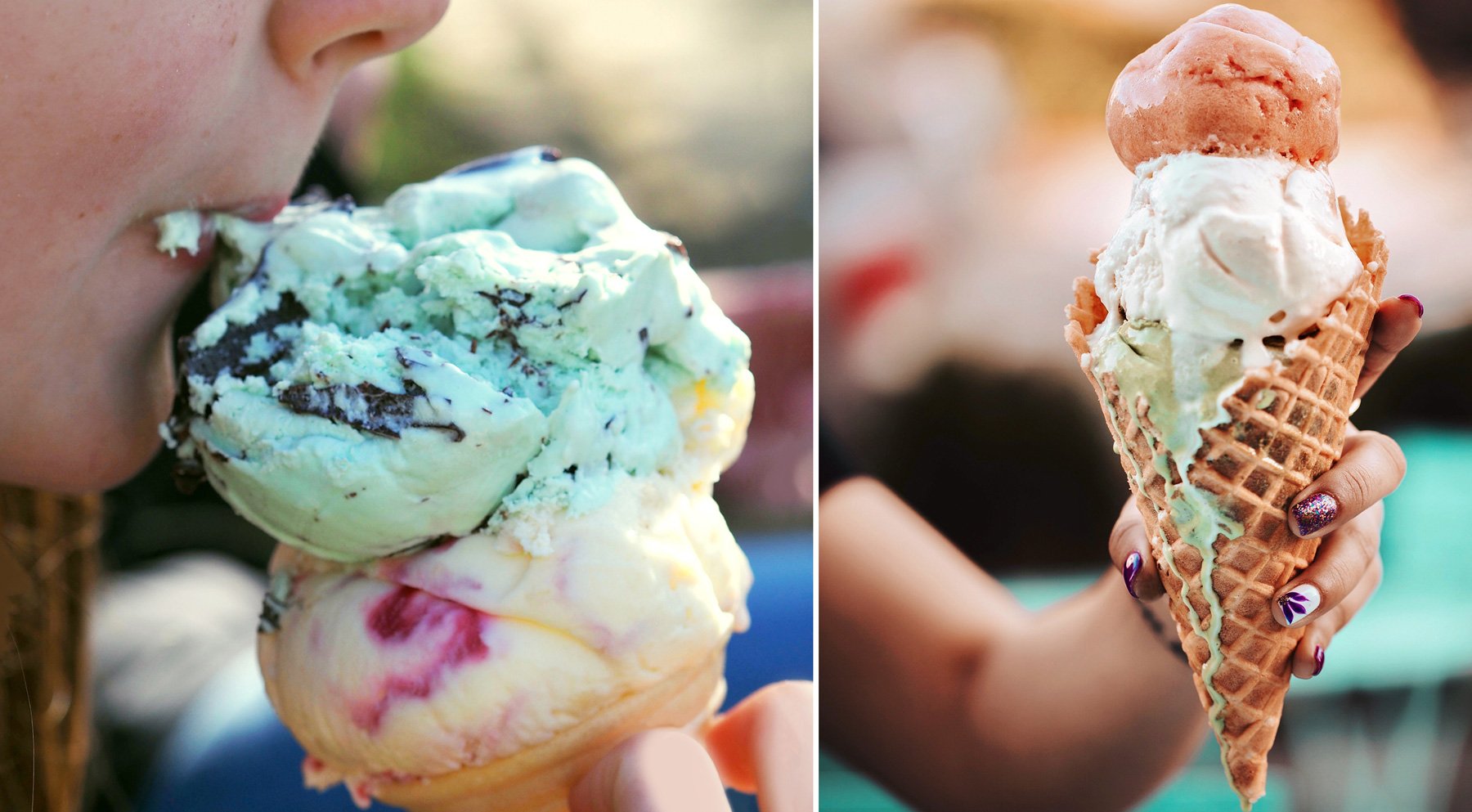
Right: Photo by Clark Douglas on Unsplash
So let’s get to the project…
Sprinkle Sundays is a Simon Spotlight series about three friends who work in an ice cream shop every Sunday. The stories are a pretty good reflection of life for that age group. It’s all about facing new challenges, and navigating tricky friendships but with a good helping of sweetness to combat the angst. Having tween-aged daughters I knew it well.
With this project there was a wonderful opportunity to create not only the main characters, but also to design the series logotype and some of the shop livery; to tackle it as if I were designing for Molly’s, the ice cream shop the series is based around.
I really enjoy working with design and hand-drawn type – Graphic Design School obviously left its mark – and luckily for me the team at Simon and Schuster, and specifically their lovely designer Hannah Frece, were happy to let me at it.

Moodboard showing vintage signage and advertising. I particularly liked the swoosh that reminded me of the ribbed pattern in soft serve.
I started looking at vintage 1950s signage, particularly the quirky casual script, sparkles, and swooshes that are such a stand-out feature of the showcard and ticket writing of the time. To me, this style positively screams ice cream. I figured if I added to that a sweet kawaii-style mascot and a fresh sorbet palette, the blend should hopefully hit just the right note.

Initial sketches playing with shapes, balancing elements and considering readability of individual letters.

More logotype development work and the final Molly’s mascot that appears on the girls aprons.

This little guy didn’t make the final cut, but I have to admit he’s my favourite. Introducing Umi Super Swirl!

Sources as they appear: • Unknown • Simply Home Cooked • Homemade Hooplah
It can be tough looking up reference images of Italian gelato (to check colours, naturally ) but fun to discover all sorts of wild flavours - anyone for Coconut-Curry, Creole Tomato, Black licorice, or Ube Macapuno? Apparently, the most vivid purples come from using Ube, a purple yam originally from the Philippines, it also happens to be one of Tamiko’s colours.
We decided that each of the girls should be given their own colours – in this case two complementary colours – which would appear on their aprons and more loosely in their outfits. The specific colours also indicate whose story it is – so ube (purple) for Tamiko, mint (green) for Allie, and cotton candy (blue) for Sierra.

So with the design decisions made and the artwork done and dusted, there was one final surprise.
I opened my box of copies to find the swoosh on the paperbacks had been glitter-ified – Thanks, Hannah! I can’t imagine a single tween that doesn’t adore glitter, almost as much as gel pens.
I think that just about does it.
If you have a middle-grader that churns through series after series, this one could well be a godsend. There are 12 titles in all, which should keep them busy for a bit. And if they really like them, they might also like The Cupcake Diaries and Donut Dreams, all written by Coco Simon.
And if you have a passion for Italian Gelato, (who can blame you) my parting gift is this quirky little film. Don't Call It Ice Cream: How Italian Gelato Artigianale Is Made – Divertiti!
You can buy Sprinkle Sundays in your favourite independent bookstore or through Simon and Schuster .